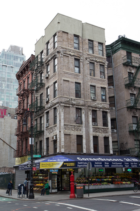

 There’s something that really bugs me about in much of what I see in urban photography. It’s letting a building look as though it’s being sucked into a black hole.
Unless you’re using a lens with tilts and swings, when you photograph a building, or even a street scene, you’re forced to point the camera lens upward to get more of the buildings into the frame. Immediately, you introduce the dreaded converging vertical sides of the buildings. You can’t help it. To see how quickly and badly it gets, do this simple experiment through the viewfinder or screen. Find a nice urban scene in your own city or town. Compose it – with the camera dead level. Notice how you’ve cut off most of what you want in the top of your imagined frame and the bottom of the frame is filled with an enormous foreground of unwanted street or sidewalk? OK, now frame the scene the way you want it. You’ve no doubt angled the camera lens upward to get more of the buildings and some of the life in the street. You’ve also introduced the sucking-into-the-black hole converging vertical lines of the buildings. This is hugely distracting because you don’t see the scene like this. It’s just what the camera and lens do.
So what can you do?
One possibility is, if you’re looking at a LCD screen, you can raise the camera vertically. And by that I mean hold the camera level and raise it strait up as long as you can comfortably see the image on the screen. With the camera as high as you can comf0rtably hold it level, THEN angle it upward to frame the scene. You’ll still have some converging verticals but they won’t be nearly as distracting and your photo will look much better.
The second thing you can do is just get yourself higher. Stand on some nearby steps or anything that can elevate your camera position. A little goes a long way.
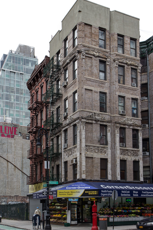
The last thing is software. And I’ve got to say, Lightroom 5 is getting to be almost the only software you need. Almost. They have a really cool new lens correction feature that has several different settings that can quickly and easily straighten the sides of architecture in a photo – provided the correction required is not too severe. I’m sure it would work on Redwoods too.
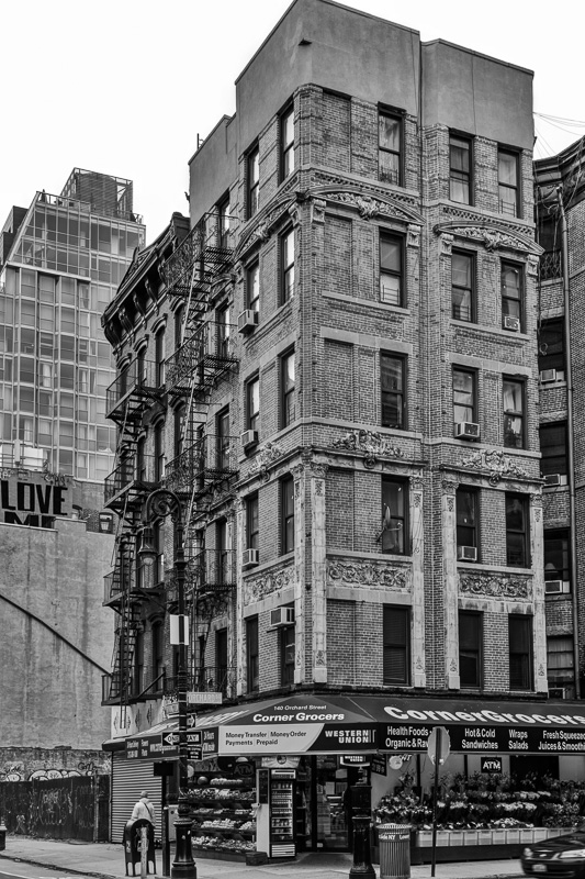
I’ve included three shot here so you can see the difference it can make. The first image is straight out of the camera. My intention was to for my finished image to be a fairly tight capture of the building standing all by itself. So I shot it with extra space around it knowing that the software correction will remove some of the image surrounding the principal architectural subject of your photo. I think I used the ‘Auto’ correction button for this one. The next image is after the correction has been applied. Note that after the correction there is less space around the building. Finally, the finished black and white conversion. Ta-Daa.
Now let me be the first to admit – there are times when severely converging vertical lines are exactly what you want. Those are the times when you want the lens to go crazy with a wild abstract geometry. Go for it.
And there are also times when, in the urban environment, you subject matter might be so compelling, that nothing else can distract from it. You know, like a knife fight on the sidewalk or a beautiful ‘defining moment’.
But for all the other times try to keep it as straight as you can and your photo memories will be much more like the way you remember it.
And as always, please help me keep this site alive by browsing through my ebooks or photo galleries of beautiful New York City black and white photography. There you can select a gorgeous high-resolution print file that you can download for only $20 and print it anywhere yourself. And I’ll donate 20% of the purchase price to one of the global humanitarian charities that you can select on checkout.
Until next time, happy shooting.
Bob