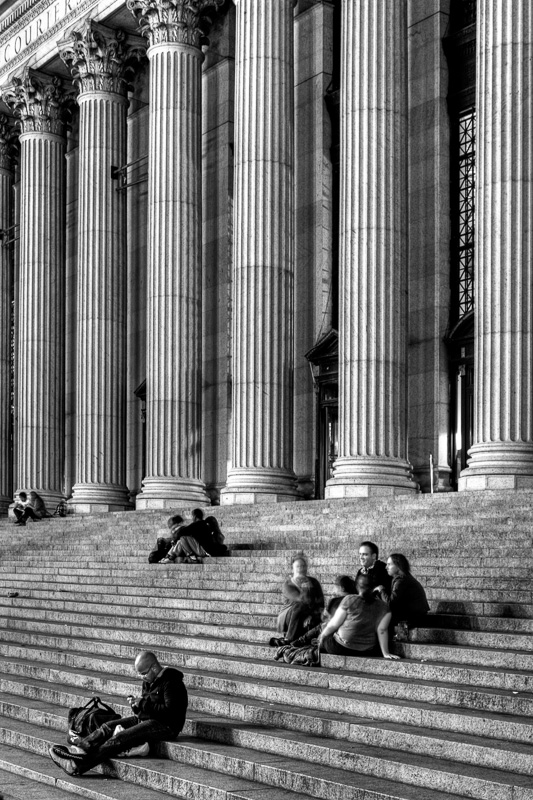
Here’s another New York City travel photography tip and a great way to add interest to both people and architecture – use people for scale and composition.
This is one of New York City’s great buildings, the US Post office building on 34th Street and 8th Avenue.
It’s columns run for nearly an entire block. And the steps, running for as long as the columns, create a nice geometric counterweight to the verticality (I think I just made up that word) of the columns.
I didn’t want just any people. I wanted to find a pattern of carbon-based units that nicely peppered the pattern of the step to balance the whole composition and demonstrate how people interact with great architecture.
And then I used a vertical frame to accentuate the verticalness (I think I did it again) of the composition.
So when you shoot architecture, look for ways to add people as compositional elements.
And as always, please help me keep this site alive by browsing through my ebooks or photo galleries of beautiful New York City black and white photography. There you can select a gorgeous high-resolution print file that you can download for only $20 and print it anywhere yourself. And I’ll donate 20% of the purchase price to one of the following global humanitarian charities that you can select on checkout: UNESCO, Unicef, Earthwatch, Doctors without Borders, Human Rights Watch and The Hunger Project
Until next time, happy shooting.
Bob